Written by: Ratikanta
Rati is the Director of Platform at Muvi. He has 12+ years of experience in Yii, Magento, PHP, Wordpress, MySql, Opencart, and Amazon EC2.
Pixels, EM’S, and REM’S are very much popular in the CSS world, but it’s often confused and mistaken with one another. Pixel(px) They are the most commonly used unit over the CSS, and the only thing you need to understand … Continue reading

Pixels, EM’S, and REM’S are very much popular in the CSS world, but it’s often confused and mistaken with one another.
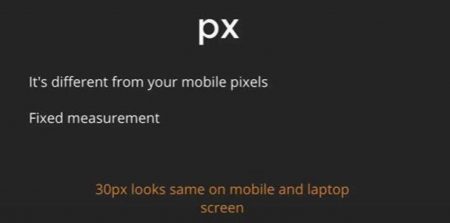
They are the most commonly used unit over the CSS, and the only thing you need to understand is that, if you resize an element as large as 100 pixels, then it’s gonna look big and gigantic on your laptop screen. The problem arises when you want to view the same content on a smaller screen, like your mobile screen, because it’s have the same gigantic look on a mobile screen as well. So be cautious when you are designing responsive websites, as pixels are not dynamic compared to em/rem.
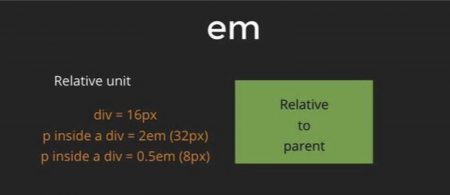
EM’s on the other hand is totally relative to their parents. So for example, let’s say you have a <div> tag and you assign it with a size of 10px. Now, if you define a <p> tag inside the <div> tag, with a size of 2em, it means that it’s going to be twice the size of its parent, which in our case would be 2 times 10pixels i.e 20px. Now, the problem here, is that it gets extremely messy if you have too much nesting and have defined every tag under every other nested tag into an EM. For instance, let’s say your <body> tag is defined as 32px, and inside that, you define a <div> tag of 2em, which means your <div> tag is now 64px, and now if this <div> tag has a <p> tag of 2em within it, then it would be around 128px. So basically, it’s too relative to its parent, thus be cautious while using it!
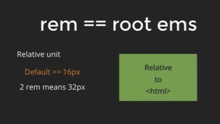
Now the third buddy we got is the REM (Root EM). To be honest REM’s are way easier and relative than any other units in CSS. REM’s are always relative to the root <html> tags. HTML tags are by default as 16px, so if you define a <h1> tag with a size of 2rem, then it means it has a size 2 times 16, which is 32px. So, no matter how messy and nested your code is, it will always be relative to the root HTML tag which is 16px by default.
So that is basically it, I hope you got what you came for. I know it’s been a while since the last article, and it’s because there’s still a JavaScript void we are yet to cover.
Written by: Ratikanta
Rati is the Director of Platform at Muvi. He has 12+ years of experience in Yii, Magento, PHP, Wordpress, MySql, Opencart, and Amazon EC2.

One Platform, Infinite Streaming Possibilities
Live & On-Demand, Audio & Video, Mobile & TV Apps, Player, and Monetization
Start free trialNo credit card required.


Add your comment